
Most service businesses invest time and money getting people to their website, then wonder why the phone stays quiet. The gap between traffic and enquiries is rarely about visibility. It is almost always about what happens after someone arrives. If your website is attracting visitors but not generating contact, read on for a practical guide to how to get more enquiries from your website.
A visitor landing on your website has already shown some level of interest. They searched, clicked, and arrived. What happens next depends entirely on whether your website gives them enough reason to stay, enough clarity to understand what you do, and enough confidence to make contact.
Most service websites lose people at this point without any obvious failure. No broken pages. No error messages. Just an exit. The visitor moves on, and the business never knows they were there.
This is a conversion problem, not a traffic problem. The process of finding and removing these barriers is at the heart of website conversion optimisation: improving the experience so a greater proportion of your existing visitors take the action you want.
Sending more visitors to a website that is not converting will not fix the underlying issue. It will simply produce more of the same silence.

After analysing more than 6,300 websites over 25 years, I see the same patterns repeat. The most common reasons service websites fail to generate enquiries include:
None of these are dramatic failures – nothing immediately appears to be broken – it’s purely because the website owner is unaware such problems are losing them business.
If you are still asking why your website is not converting, it is worth working through the problem systematically rather than assuming you simply need more traffic.
There is no single benchmark that applies across all service businesses. Enquiry rates vary significantly depending on the type of service, the traffic source, the average transaction value, and how competitive the market is.
A solicitor handling high-value commercial work will see different numbers from a local plumber. A business running paid search traffic to a specific landing page will convert differently from one relying on organic search to a general homepage.
What matters more than chasing a headline figure is understanding your own baseline and improving from it. If you know how many visitors your site receives and how many enquiries result, you have a starting point. From there, the goal is to move that ratio in the right direction, consistently, over time.
A visitor who cannot tell within a few seconds what you do, who you do it for, and why they should choose you will leave. This is not impatience. It is how people make decisions when they have options.
The clearest test is to look at your homepage headline and ask: does this tell a stranger exactly what problem I solve? If the answer is a company name, a tagline about values, or a vague phrase like “solutions for your business,” it is not doing its job.
Lead with the outcome the customer gets, not the service you provide. “Accountancy services for small businesses” is a description. “Take the stress out of your tax return” is a reason to stay.
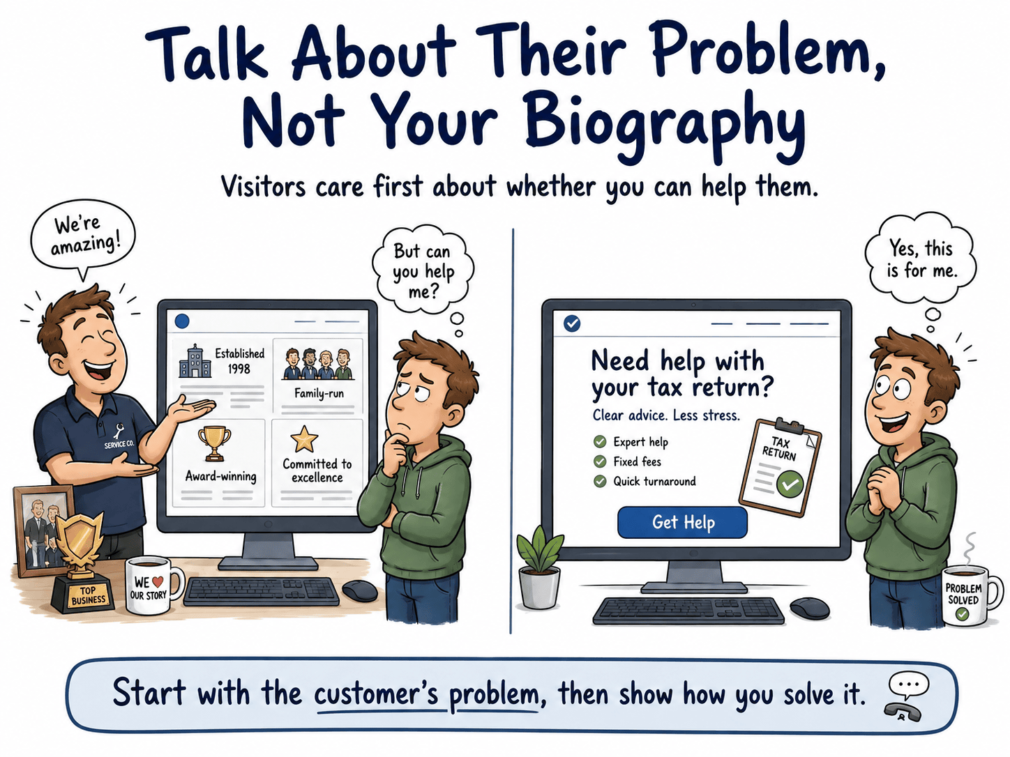
Most service website copy is written from the inside out. It describes what the business does, how long it has been trading, and what qualifications the team holds. The visitor, who arrived with a specific problem, has to work out whether any of this applies to them.
Rewrite copy from the outside in. Start with the customer’s situation. Name the problem they are trying to solve. Then explain how you solve it. A solicitor’s website might open with “Buying a property is one of the biggest financial decisions you will make. Here is how we make the legal side straightforward.” That is a different conversation from a list of practice areas.
Industry terminology creates distance. It signals to a visitor that this website was written for peers, not for them. A heating engineer who writes about “HVAC system commissioning” will lose the homeowner who just wants their boiler replaced.
Plain language is not dumbing down. It is respecting the reader’s time. If a sentence requires the visitor to already know what you mean, rewrite it. Read your copy aloud. If it sounds like a brochure, it probably reads like one too.
A first-time visitor to your website is a stranger. They have no prior experience of your work, no recommendation from someone they know, and no reason yet to believe you are the right choice. Trust signals exist to close that gap.
For service businesses, the trust signals that carry most weight are:
The placement of these signals matters as much as their presence. A testimonial buried at the bottom of a page that most visitors never reach is not doing useful work.

A testimonial that says “Great service, highly recommend” tells a prospective enquirer almost nothing. It is easy to dismiss because it could apply to any business in any sector.
A testimonial that says “I contacted three accountants before choosing this one. The response was fast, the advice was clear, and my tax return was filed with no stress on my part” is specific, credible, and directly relevant to someone in the same situation.
When collecting testimonials, ask clients to describe the situation they were in before they contacted you, what the experience was like, and what changed as a result. That structure produces testimonials that actually persuade.
For businesses where the work is visible, a portfolio or case study section removes a significant barrier to enquiry. A prospective client who can see many examples of completed work, read about the brief, and understand the outcome is far closer to making contact than one who has only read a service description.
Keep case studies specific. Name the type of client, the challenge, the approach, and the result. Vague summaries add little. Concrete examples – and plenty of them – build confidence.
“Contact Us” is not a call to action. It is a label. It tells the visitor where to go but gives them no reason to go there.
A call to action on a service website should reflect what the visitor gets by making contact. “Get a free quote,” “Book a no-obligation call,” or “Ask me a question” are all more specific and more compelling than a generic instruction. They reduce the perceived risk of making contact by making the next step feel low-commitment and clear.
The language should match the nature of the service. A solicitor might use “Request a confidential consultation.” A web designer might use “Tell me about your project.” The goal is to make the action feel like a natural next step, not a sales process.
A single call to action at the bottom of a page will be missed by most visitors. Different visitors reach different points before they are ready to act. Some will decide quickly. Others will read everything before committing.
Place calls to action:
Vary the framing too. Not every call to action needs to be identical. A visitor who has just read a case study might respond to “See if I can help with something similar.” A visitor on a pricing page might respond to “Get a quote for your project.” Matching the prompt to the context increases the chance of a response.
Every field you add to a contact form is a small barrier. Some barriers are worth it. Most are not.
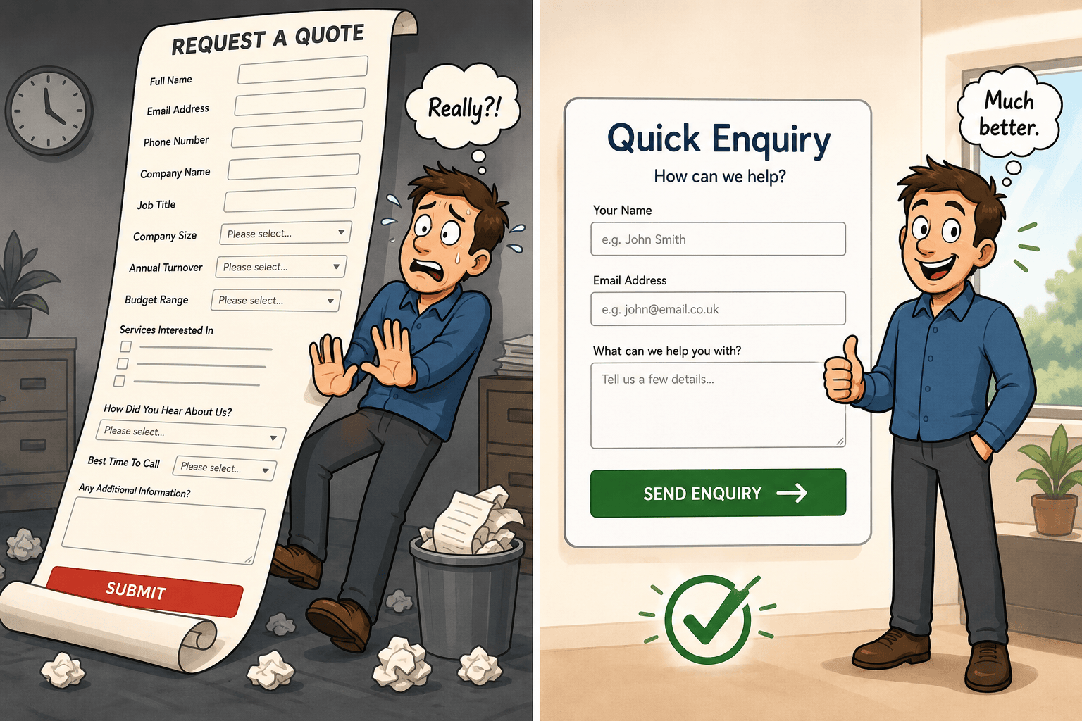
A form that asks for name, email, phone number, company name, company size, how they heard about you, their budget range, their preferred contact time, and a message box is not thorough. It is exhausting. Many visitors will abandon it before they finish.
For most service businesses, a form with three to five fields is enough to start a conversation. Name, email or phone, and a brief description of what they need. That is sufficient to respond. Everything else can be gathered in the follow-up.
Also add in a reassuring message nearby where people submit the form, telling them: ‘Your details will be used purely to respond to your enquiry and not for any other marketing purposes’. That in itself can achieve more enquiries from people who would otherwise worry about ending up on a list to be ongoing sold to.
A contact page is not enough on its own. Many visitors who are ready to enquire will not navigate away from a service page to find a contact form. If the form is not on the page they are already reading, some of them will simply leave.
Embedding a short enquiry form directly on key service pages removes that friction. The visitor does not need to make a decision to navigate. The form is already there, in context, at the point where their interest is highest.
Your contact page should do more than display a form. It should reassure the visitor that making contact is the right decision and that the process will be straightforward.
A well-structured contact page includes:
That last point is often overlooked. A visitor on the contact page is close to enquiring. Well-placed testimonials at that moment can be the final reassurance they need.
The same principles apply even more strongly to campaign-specific pages, where landing page optimisation is about removing distractions, building confidence and making one next step as easy as possible.
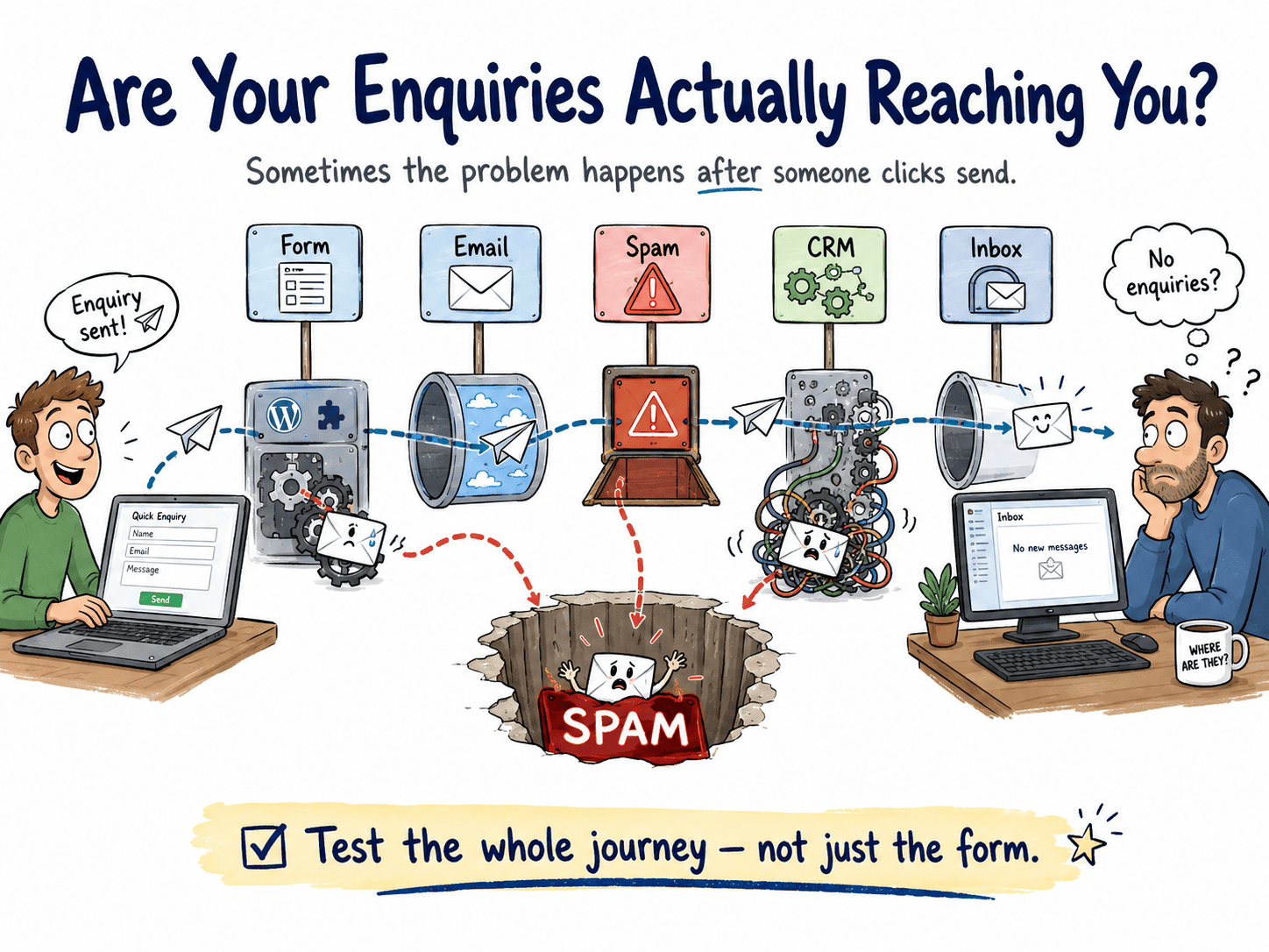
Ideally, you would already be aware of how often contact forms are completed, and would notice if that hadn’t happened recently. If you’re keen to avoid losing enquiries then these contact form-related actions will help …
This is one of the most overlooked issues I encounter. A business owner assumes their contact form is working because it has always worked. But form submissions can stop arriving without any visible sign of failure on the website itself.
Test every form on your website by submitting it yourself, using a personal email address that is separate from your business inbox. Check that:
Do this from a mobile device as well as a desktop. Form behaviour can differ between devices.
If a form submission is sent but never received, the failure can happen at several points in the chain:
Check your spam or junk folder regularly, particularly if you have recently changed your email provider or hosting. Ask your web developer or hosting provider whether your domain has the correct sending records in place. These are technical settings, but the consequences of getting them wrong are entirely practical: real enquiries disappearing without trace.
An email notification is not a reliable sole indicator that a form submission was received. Email delivery can fail. A thank-you page cannot.
When a visitor submits a form and is redirected to a dedicated thank-you page, that page load is recorded in your analytics regardless of whether the email notification arrives. This gives you an independent signal that a submission occurred.
Set up your thank-you page as a trackable destination in your analytics. If you see thank-you page visits but no corresponding email notifications, you have a delivery problem to investigate. If you see neither, you may have a form submission problem. The two signals together give you a much clearer picture than email alone.
A form that worked last month may not work today if something on your website has changed. Plugin updates, theme changes, hosting migrations, and email provider switches can all break form delivery without any visible warning.
Build a habit of testing your contact forms after any significant change to your website or its infrastructure. This takes five minutes and can prevent weeks of missed enquiries going unnoticed.
For most UK service websites, the majority of visitors are arriving on a mobile phone. A website that works well on a desktop but is awkward on a mobile is not a minor inconvenience. It is a conversion problem affecting most of your audience.
Mobile experience issues that reduce enquiries include:
Check your own website on your phone, not just in a desktop browser’s mobile preview. The experience is often different, and the problems are more obvious when you are actually using the device.
A slow website does not just affect search rankings. It affects how a visitor feels about your business before they have read a single word.
When a page takes several seconds to load, the visitor’s first impression is one of waiting. That waiting creates doubt. It signals, however unfairly, that the business may not be well-maintained or professional. For a service business where trust is the primary currency, that is a costly first impression.
You do not need to understand the technical causes of slow loading to act on it. Load your website on a mobile connection and time how long it takes before you can read the main content. If it feels slow to you, it will feel slow to your visitors. That is enough reason to investigate.
A service page that consists of a heading, two sentences, and a contact button is not giving a visitor enough to work with. Someone who has landed on that page is already interested. What they need is enough information to feel confident making contact.
A well-built service page covers:
This is not about length for its own sake. It is about giving a visitor the information they need to make a decision, without making them search for it elsewhere.
One of the most common reasons people do not enquire is uncertainty about what happens next. They are interested, but they do not know what contacting you will involve. Will there be a hard sell? Will they be committed to something before they understand the cost? Will the process be complicated?
A short process section on a service page removes that anxiety. Something as simple as “Here is how it works: you send me a message, I respond within one working day, we have a short call to discuss your situation, and I send you a clear proposal” tells the visitor exactly what to expect. That clarity reduces hesitation.
Every service business has a set of questions that prospective clients ask repeatedly. These questions exist because the information is not already visible on the website. Each unanswered question is a reason to delay making contact.
Identify the five or six questions you hear most often and answer them directly on the relevant service page. Common examples for UK service businesses include questions about cost, timescales, geographic coverage, what information is needed to get started, and whether an initial conversation is free.
Answering these questions does not reduce the need for an enquiry. It removes the barrier to making one.
Receiving enquiries that are not a fit wastes time on both sides. A business that works exclusively with clients in the South East, or only takes on projects above a certain value, can signal that clearly without making the website feel unwelcoming.
Plain, factual statements work well here. “I work with businesses across the Midlands and the North of England” or “My projects typically start from £2,500” are honest and useful. They filter out poor-fit enquiries before they arrive, and they reassure the right visitors that they are in the right place.
A small number of qualifying fields on a contact form can improve enquiry quality without significantly increasing friction. The key is to keep them optional where possible and to make them feel relevant rather than interrogative.
Useful qualifying fields might include:
Avoid fields that feel like a screening process. A visitor who feels they are being assessed before they have even spoken to you is less likely to complete the form. The goal is to gather enough context to respond usefully, not to pre-qualify them out of the conversation.
Not all enquiries are equal, and not all traffic sources produce the same quality of contact. A visitor who found you through a specific search for your service in your area is likely to be a better fit than one who arrived through a broad, generic search term.
Use your analytics to track which pages visitors were on before they submitted an enquiry. Over time, patterns will emerge. Some pages will consistently produce good enquiries. Others will produce volume but poor fit. That information tells you where to invest more effort and where to adjust your messaging.
If you are running paid search campaigns, source tracking becomes even more important. Knowing which campaigns and keywords produce enquiries that convert into work, rather than just enquiries that arrive, is the difference between spending money and investing it.
Your analytics data contains a map of where potential enquirers are dropping off. Pages with high exit rates, short average time on page, or low scroll depth are telling you something. The question is what.
A high exit rate on a service page might mean the messaging is unclear. It might mean the page loads slowly. It might mean the visitor found what they needed and left to call you directly. Context matters. Look at the data alongside the page itself, not in isolation.
The most useful starting point is to identify the pages that receive meaningful traffic but produce few or no enquiries. Those are the pages where improvement will have the most impact. Looking at those pages as stages in a journey also helps you improve your sales funnel, because you can identify where interest is turning into hesitation and fix that specific point.
A/B testing means showing two versions of a page to different visitors and measuring which one produces more of the outcome you want. For a service website, that outcome is usually an enquiry.
You do not need a development team to run basic tests. Many website platforms allow you to create a duplicate page, make a single change, and compare performance over time. The single change part is important. If you change the headline, the call to action, and the layout simultaneously, you will not know which change made the difference.
Start with the elements most likely to affect conversion: the headline, the call to action text, the placement of the enquiry form, or the presence of a testimonial near the form. Test one thing at a time, give each test enough time to gather meaningful data, and act on what you find.
Find out more about how A/B testing works.
There is no universal conversion rate that applies to all service websites. A business handling high-value, low-volume work will see different numbers from one handling frequent, lower-value transactions. Traffic from a referral will convert differently from traffic from a paid ad.
What benchmarking can usefully tell you is whether your current rate is plausible given your context, and whether changes you make are moving it in the right direction. If your rate is significantly lower than a reasonable expectation for your sector and traffic type, that is a signal worth investigating. If it is improving month on month, that is a signal worth continuing.
Set your own baseline, track it consistently, and measure improvement against that. That is more useful than comparing yourself to a headline figure that may not reflect your situation at all.
Three to five fields is enough for most service business enquiry forms. Name, a contact method, and a brief description of what the visitor needs gives you enough to respond. Additional fields should only be added if they genuinely help you respond more usefully, not for the sake of completeness.
There is no single answer, as rates vary considerably by sector, traffic source, and service type. Rather than targeting a specific figure, establish your own baseline and focus on improving it over time through the changes covered in this article.
Responding within one working day is a reasonable standard for most service businesses, and stating that commitment on your contact page sets a clear expectation. Faster is better where possible: a response within a few hours of an enquiry arriving significantly increases the likelihood of a conversation taking place.
Poor-fit enquiries usually mean the website is not clearly signalling who the service is for, what it costs, or where you work. Review your service pages and contact form for opportunities to state minimum fit criteria plainly, and check your analytics to identify which traffic sources are producing the least relevant visitors.
Getting more enquiries from your website does not require more traffic. It requires a clearer message, stronger trust signals, and a frictionless path to contact. Start by testing every form on your site to confirm submissions are actually arriving, then review your service pages to ensure they give a visitor enough to act on. If you want to understand how to get more enquiries from your website in a way that is specific to your situation, take a look at what your analytics are already telling you. The answers are usually there.
Need help with getting started on this minefield of actions to choose from? Take advantage of booking in a free call with me. No sales pitch – just useful information that will highlight the next big win for you from your website.