
There is a significant difference between a website that gets traffic and one that turns visitors into enquiries. For marketers trying to close that gap, the answer often lies not in more spend or more pages, but in the quality of a single, focused page. Read on for everything you need to know about landing page optimisation.
Landing page optimisation is the process of improving a single web page so that a higher proportion of visitors take one specific action. That action might be submitting an enquiry form, requesting a quote, booking a call, or downloading a resource. The page exists for that purpose alone.
The landing page optimisation definition is straightforward in principle: remove everything that works against conversion and strengthen everything that works for it. In practice, that means examining every element on the page, from the headline to the form to the button text, and asking whether it helps or hinders the visitor in taking that one action.
What makes this discipline distinct is its precision. You are not trying to improve a website. You are trying to improve the performance of one page against one measurable goal. That constraint is not a limitation. It is what makes the work tractable and the results measurable. Landing page optimisation is one focused part of the wider discipline of website conversion optimisation, which looks at how the whole website turns visitors into enquiries or sales.
A standard web page serves multiple purposes. A homepage introduces a business. A services page explains what is on offer. A blog post informs or educates. Each of these pages is designed to be part of a broader site structure, with navigation, links, and pathways that invite the visitor to explore.
A landing page does none of that. It has one job. Navigation is typically removed or reduced. There are no links pulling the visitor elsewhere. Every element on the page points toward the same conversion action.
This is why treating a landing page like a standard web page is one of the most common and costly mistakes I see. The two serve different functions, and they need to be built and evaluated differently.
A landing page that converts well is not the result of good design instinct alone. It follows a structure that has been tested across many contexts and consistently produces results. The core components are:
Each of these elements earns its place by serving the conversion goal. If an element does not contribute to that goal, it is a distraction.
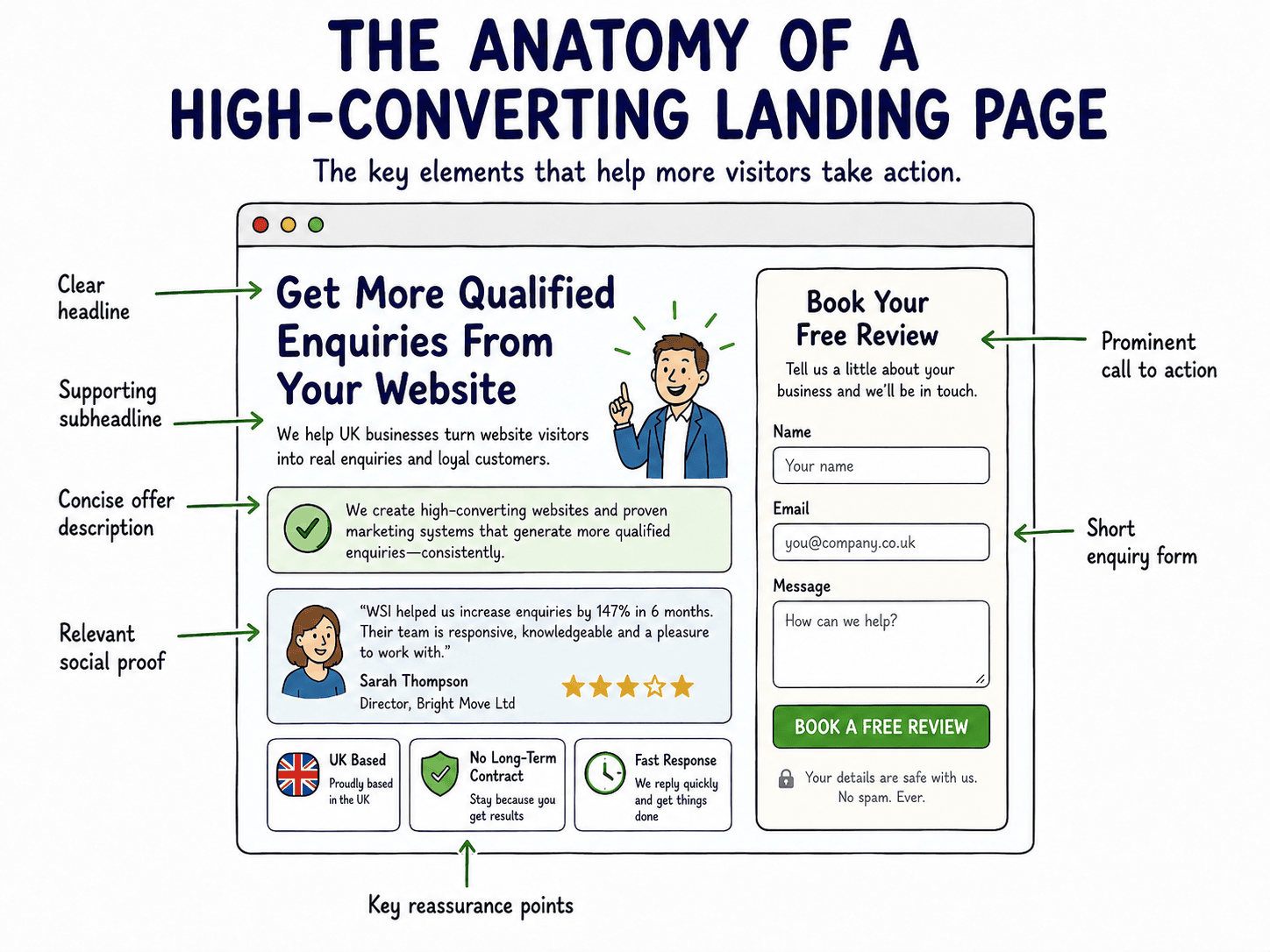
The content visible before a visitor scrolls carries disproportionate weight. If the headline does not immediately signal relevance, most visitors will leave. This is not a theory. It is a pattern I have observed across hundreds of page reviews.
Above the fold, the visitor needs to understand three things within a few seconds: what the page is about, what they are being asked to do, and why it is worth their time. If any of those three are unclear, the rest of the page rarely gets read.
UK audiences, in my experience, respond well to directness. Vague or clever headlines that require interpretation tend to underperform against plain, specific ones.
Once a visitor decides to stay, the page needs to guide them toward the conversion action without confusion. Directional cues do this work. They include visual hierarchy, white space, contrasting button colours, and the logical sequencing of information.
The flow should feel natural: arrive, understand the offer, see the evidence, take the action. Any element that interrupts that sequence, whether it is an unexpected link, a competing message, or a cluttered layout, reduces the likelihood of conversion. Simplicity is not a stylistic preference here. It is a functional requirement.
The value proposition is the answer to the question every visitor is silently asking: why should I choose this, and why now? It is not a tagline. It is a clear statement of what the visitor gets, who it is for, and what makes it worth their attention.
A strong value proposition is specific. “We help businesses grow” tells a visitor nothing. “We help UK manufacturers reduce their cost per enquiry from paid search” tells them exactly who this is for and what outcome to expect. Specificity builds credibility. Vagueness erodes it.
The headline is the first piece of copy a visitor reads and often the last if it does not land. Effective headline optimisation is less about creativity and more about clarity and relevance.
Techniques that consistently perform well include:
A headline that speaks directly to the visitor’s situation will outperform a clever one almost every time.
Message match refers to the alignment between what an ad says and what the landing page delivers. When a visitor clicks an ad promising a free audit for UK accountancy firms and arrives at a generic homepage, the disconnect is immediate. Trust drops. Bounce rates rise.
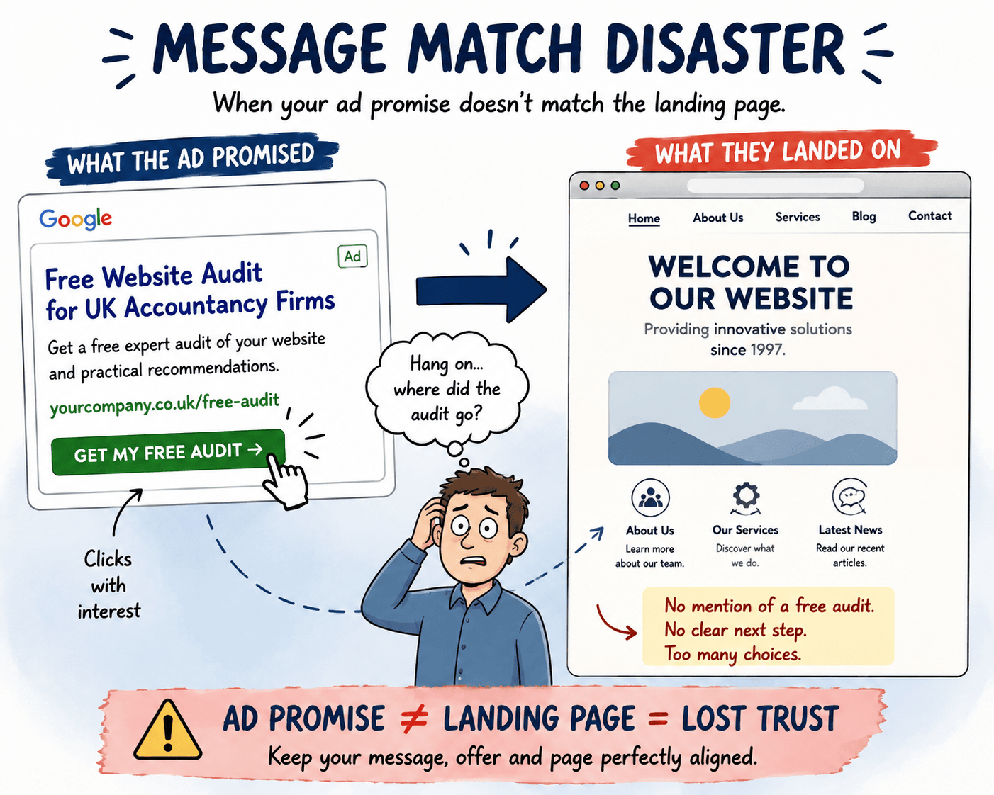
Strong message match means the headline, offer, and tone of the landing page reflect the specific ad that brought the visitor there. This is one of the highest-leverage improvements available in a landing page optimisation strategy, particularly for paid search campaigns where every click has a cost attached.
The call to action is the point at which intent becomes behaviour. Its wording, placement, and visual prominence all affect whether a visitor acts or leaves.
Effective CTAs share a few characteristics:
Avoid CTAs that create uncertainty. If a visitor is unsure what clicking a button will do, they will not click it.
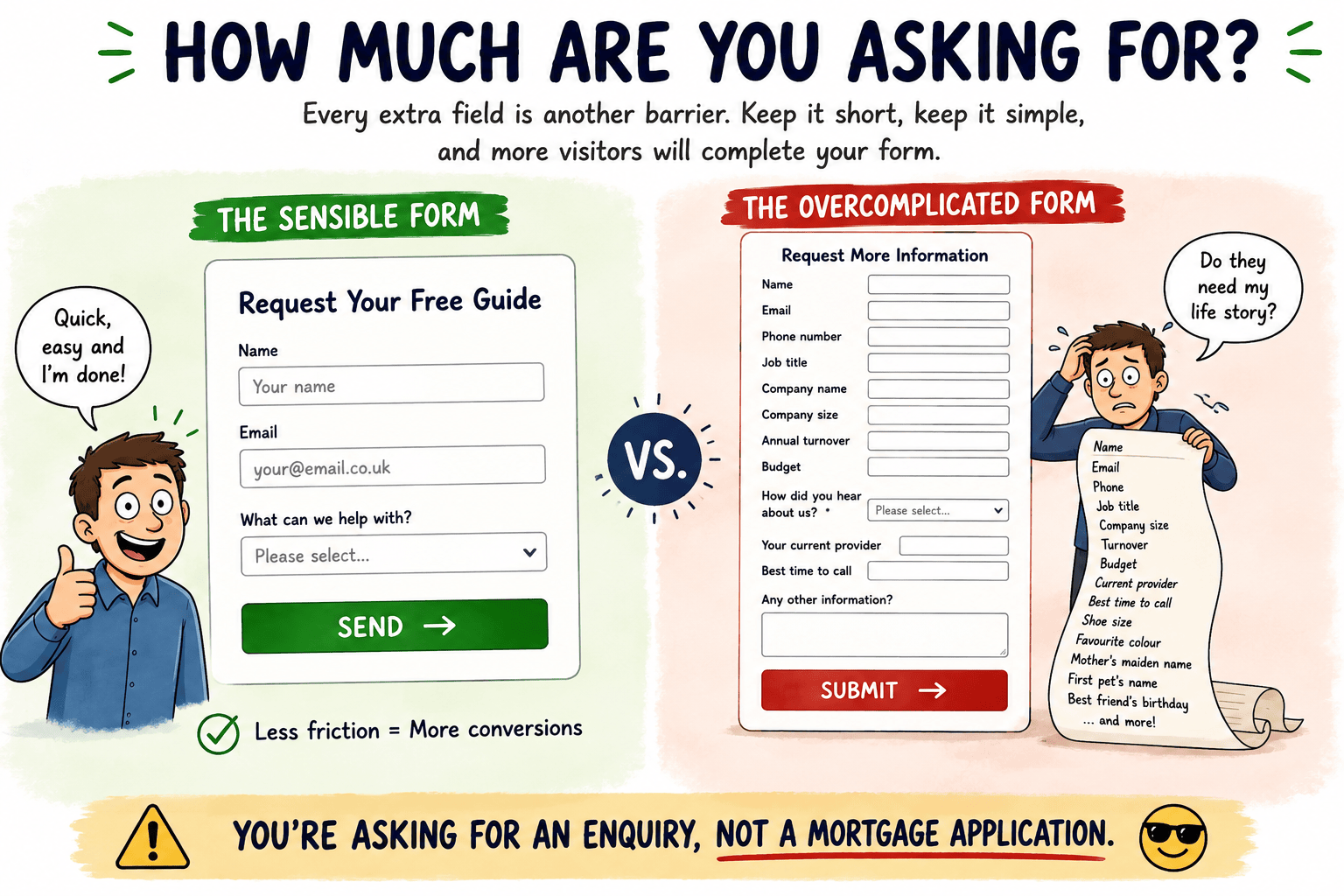
Every field added to a form is a small barrier. Some barriers are necessary. Most are not. The principle is simple: ask for only what you genuinely need at this stage of the relationship.
For most lead generation pages, a name, email address, and one qualifying question is sufficient to start a conversation. Phone numbers can be optional. Company size, budget range, and other qualifying fields can often wait until a follow-up.
GDPR compliance is non-negotiable for UK audiences. A brief, plain-English note explaining how form data will be used, alongside a link to a privacy policy, reduces anxiety and increases submission rates. Visitors are more likely to share their details when they understand what happens to them.
UK visitors are sceptical by nature, and that is not a criticism. It is a useful characteristic to design for. Social proof and trust signals address the unspoken question: is this business credible enough for me to hand over my details?
Effective trust signals for UK audiences include:
Generic five-star claims without attribution carry little weight. Specific, attributed testimonials that describe a real outcome carry considerably more.
A slow page loses visitors before they have read a single word. The relationship between load time and conversion rate is well established: as pages take longer to load, a measurable proportion of visitors leave before the page finishes rendering.
For landing pages specifically, speed matters more than on most other page types because the traffic is often paid. A slow page wastes ad spend at the point of arrival. Improvements worth prioritising include compressing images, reducing unnecessary scripts, and ensuring the hosting environment is adequate for the traffic volume the page receives.
Treat load time as a directional concern rather than chasing a specific score. The goal is a page that loads quickly enough that speed is never the reason a visitor leaves.
A significant proportion of UK web traffic arrives on mobile devices, and landing pages need to be built with that in mind from the start, not adapted as an afterthought.
On a smaller screen, the hierarchy of a landing page changes. The headline needs to be readable without zooming. The CTA button needs to be large enough to tap without frustration. Forms need to be easy to complete on a touchscreen keyboard. Any element that works well on desktop but creates friction on mobile is a conversion problem.
Testing the page on an actual mobile device, rather than relying solely on a desktop preview, reveals issues that are otherwise easy to miss.
SEO for a standalone landing page is a narrower task than site-wide search optimisation. The focus is on ensuring the page can be found and understood by search engines for the specific query it is designed to serve.
Practical considerations include:
For paid search landing pages that are intentionally kept out of organic search, ensuring the correct directives are in place is equally important.
Every decision on a landing page, from the headline to the form length, should be informed by a clear understanding of who is arriving and what they are trying to resolve. Audience research does not need to be elaborate. It needs to be honest.
Useful inputs include reviewing the search terms that bring visitors to the page (which you can see via Google Search Console), reading the language customers use in reviews and enquiries, and identifying the specific concern or trigger that makes someone look for this type of offer. When the page reflects the visitor’s own language and situation back to them, it feels relevant. Relevance is what keeps people reading.
A single landing page cannot speak equally well to every type of visitor. Personalisation at the page level addresses this by tailoring what a visitor sees based on where they came from or what segment they belong to.
This might mean:
The goal is relevance. A visitor who arrives on a page that speaks directly to their situation is more likely to convert than one who arrives on a generic version of the same offer.
A/B testing is the process of showing two versions of a page to different visitors and measuring which one produces more conversions. The discipline is straightforward in principle and frequently misapplied in practice.
The most common mistake is testing too many variables at once. If the headline, image, and CTA button all change between versions, there is no way to know which change drove the result. Effective A/B testing changes one element at a time, runs for long enough to reach a statistically meaningful sample, and draws conclusions from data rather than preference.
Start with the elements most likely to have the largest impact: the headline, the CTA wording, and the form length. These tend to produce more measurable differences than colour changes or minor layout adjustments.
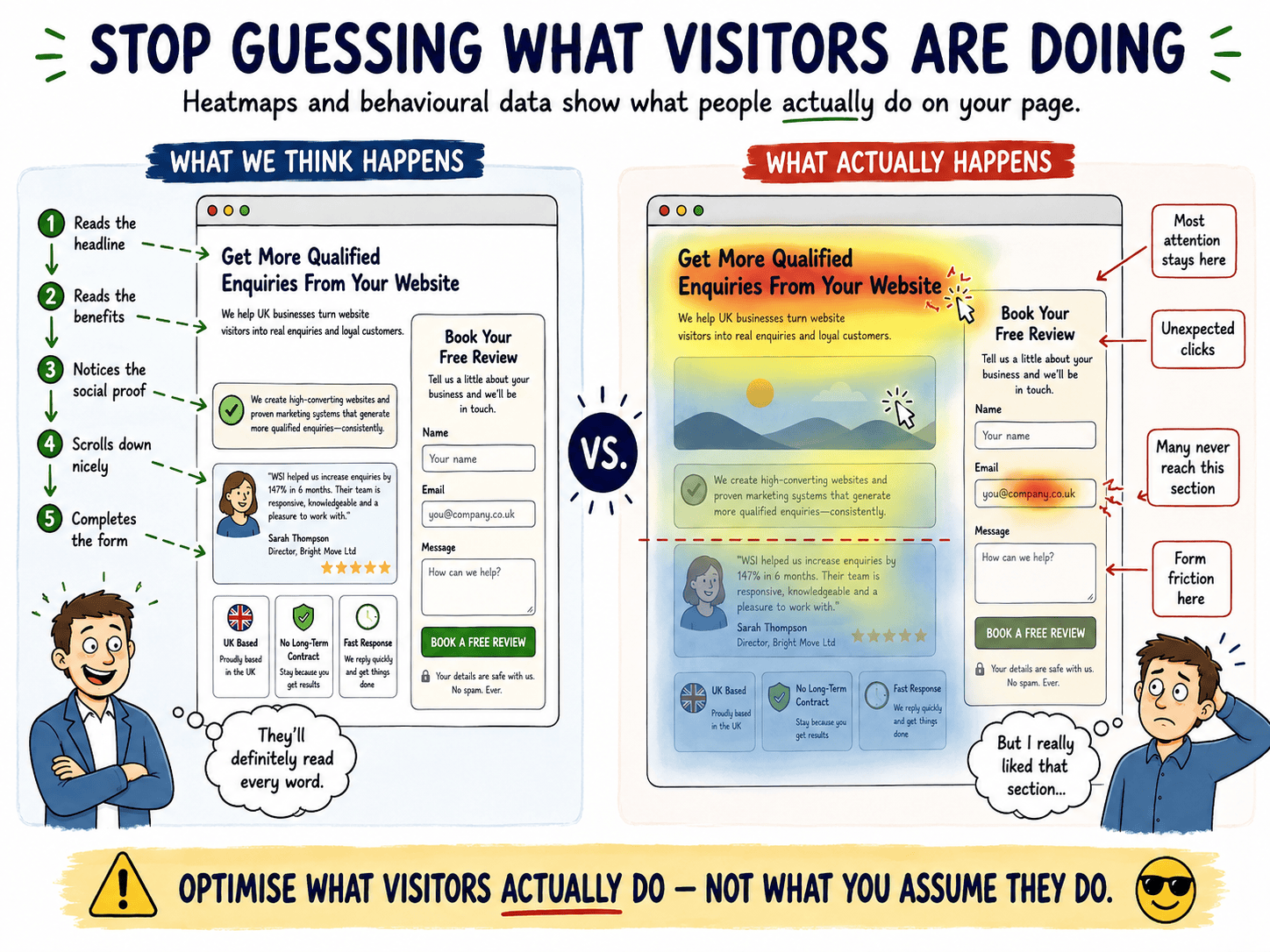
Heatmaps (e.g. Microsoft Clarity, which is free) show where visitors click, how far they scroll, and where their attention concentrates on a page. This type of behavioural data answers questions that conversion numbers alone cannot.
If a heatmap shows that most visitors never scroll past the first section, the content below that point is not being seen. If visitors are clicking on an image or a heading that is not a link, they may be expecting interactivity that is not there. If the form is being abandoned at a specific field, that field is creating friction.
Behavioural analytics do not replace testing. They inform it. They help identify where to focus testing effort rather than guessing.
A landing page needs one primary conversion goal, and that goal needs to be measurable. Without a defined KPI, there is no basis for knowing whether changes are working.
The primary KPI is typically the conversion rate: the percentage of visitors who complete the desired action. Supporting metrics might include:
Set these before making changes, not after. Retrospective goal-setting produces unreliable conclusions and makes it harder to build a consistent picture of what is improving over time.
The design mistakes that most reliably reduce conversion rate share a common thread: they prioritise appearance over function. A page can look polished and still fail to convert if the structure works against the visitor.
Errors I see repeatedly include:
Each of these errors has a direct cost. They are not aesthetic preferences. They are conversion problems.
Copy that does not convert is usually not bad writing. It is writing that is focused on the wrong thing. The most common copywriting mistakes on landing pages are:
Conversion rates vary considerably by sector, traffic source, and offer type, so a single benchmark figure is rarely useful. As a directional guide, rates across B2B lead generation pages in the UK tend to sit somewhere between 2% and 10%, with higher rates typically seen on pages with highly targeted traffic and low-friction offers. The more meaningful question is whether your page is improving over time relative to its own baseline.
There is no fixed timeline, because the pace of improvement depends on traffic volume, testing cadence, and how significant the initial issues are. A page with clear structural problems can show meaningful improvement within weeks of addressing them, while incremental gains through systematic A/B testing may take several months to accumulate. The process is ongoing rather than finite.
Landing page optimisation focuses on a single page with a single conversion goal, whereas website optimisation addresses performance across an entire site, including navigation, information architecture, and multi-page user journeys. The two are related but distinct disciplines. A landing page is evaluated almost entirely on whether it converts; a website is evaluated on a broader set of behaviours and outcomes.
A landing page that converts well is the result of deliberate decisions, not luck or good design instinct. The principles covered in this guide, from message match and value proposition clarity to form friction and behavioural analytics, give you a structured way to assess what is working and what is not on any page you are currently running.
If there is one thing to act on first, it is this: pick your single most important landing page, define its conversion goal clearly, and measure its current rate before changing anything. That baseline is where all meaningful landing page optimisation work begins.
If you would like a second pair of eyes on a page that is not performing as it should, I am happy to take a look. Get in touch and we can start from what the data actually shows.